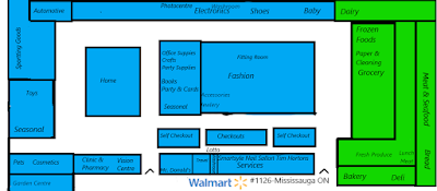
Here are two diagrams that I've made showing a typical division 1 Walmart Supercentre and a large format Supercentre layout that Walmart Canada typically uses. All diagrams are made by myself by memory, so some things may be wrong.
Here's a map of a typical new build "Arch Model" Walmart Store. This model has a smaller single entrance version, which has the same basic layout. But the one above is of a regular Supercentre. Walmart typically puts the grocery on the right side, but will sometimes put it on the left side. Walmart still uses this layout to this day and has not changed it in the Yellow and Blue decor prototype.
A Division 1 Supercentre is a Division 1 store that has been upgraded to a Supercentre during the Project Impact Era without any physical expansion. Walmart built these Division 1 stores in the Early 2000s then renovated them to the Supercentre format. Stores that didn't get expanded, but remodelled typically have the above layout.
I hope that this post helped you familiarize yourself with the different layouts that Walmart typically uses in Canada.
Large Format Supercentre
 |
| Typical Impact Era Large-format Supercentre (One of my older maps I've made) |
Here's a map of a typical new build "Arch Model" Walmart Store. This model has a smaller single entrance version, which has the same basic layout. But the one above is of a regular Supercentre. Walmart typically puts the grocery on the right side, but will sometimes put it on the left side. Walmart still uses this layout to this day and has not changed it in the Yellow and Blue decor prototype.
Division 1 Supercentre
 |
| Typical remodelled Division 1 store expanded to a Supercentre |
A Division 1 Supercentre is a Division 1 store that has been upgraded to a Supercentre during the Project Impact Era without any physical expansion. Walmart built these Division 1 stores in the Early 2000s then renovated them to the Supercentre format. Stores that didn't get expanded, but remodelled typically have the above layout.
This model typically have the Vision Centre and Photocentre in the entrance way and features the grocery section in the middle, usually without service departments like in a larger Supercentre.Also it has a full produce section, a aisle of packaged meats, and a aisle of baked goods. In the Yellow and Blue decor package, the grocery section gets moved to the right or left depending on entrance position and has a full Bakery and Deli added.
I hope that this post helped you familiarize yourself with the different layouts that Walmart typically uses in Canada.
Until next post,
DZ

Comments
Post a Comment
RULES: Comments are subject to approval before showing up. Please stay on topic and be civil.